Have you ever paid close attention to the subtitles of your favorite Netflix show? Though it looks like a simple choice, deep strategy is involved in choosing the right typeface to allow comfort to a watcher’s eyes to give them the ability to read it at speed so the concentration from a story is never taken away.
Whether you’re typing out a document or creating the next pitch presentation, there can be a constant struggle between making your work look attractive to the reader. A good design shows care and attention, which can, in many scenarios, be the attention grabber. It might even win you the pitch!
The idea of font pairings is to choose the right fonts for whatever you may want to communicate while balancing the art of compelling, attractive design as opposed to a boring, lifeless one. Think about how many times you’ve actually gone through the trouble of checking out each of the typefaces that came along with your computer, yet eventually ending up at the classics Times New Roman or Arial.
Before we move further, it’s important to understand the different types of fonts that exist to understand all the choices you have to pick from. We also provide some attractive examples of font pairings later on for an idea towards your next design!
Understanding Typography
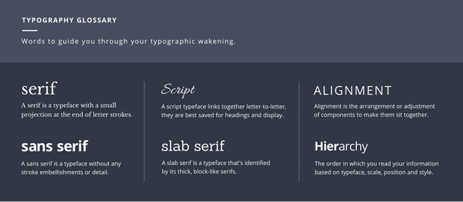
Typography – it’s a word many of you might have come across, or rather might be completely oblivious to the importance given to it. While some may be deeply familiar with it, some may not fully understand its significance when it comes to visual design.
So, what really is Typography? The Oxford dictionary describes it as “the style and appearance of printed matter”. However, it goes deeper – it’s the art and technique behind the arrangement of type, type meaning all letters and characters.
Here’s a very easy way to visualize it: typography in children’s books is always much more playful, colorful and all over the place, aren’t they? That’s because a child’s mind is flattered with colors and playful ideas, especially when you compare it to your science books from middle school, it gets serious and let’s be honest – it’s not a very fun task to read through.
You must have the same attention to detail when working with typography. In fact, different moods, atmospheres, and emotions can be expressed, or rather influenced, simply through the choice of type.
What is good typography and why it’s important to have it
Typography is especially important in branding. It can give your business a unique personality that can differentiate you against all your competitors. For example, have a look at the image below – it showcases the brands you know the most, but this time, pay close attention to its typeface:
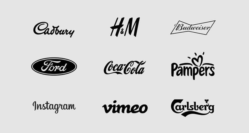
While these brands have completely different logotypes (a logo made primarily of typography), they’re all legible. Ask yourself for a moment – how does Cadbury make you feel? Do you have an answer? Great! Now compare it some of these details related to its type –
- It follows the style called ‘Script’, which is defined to mimic a handwriting, very similar to ‘Calligraphy’.
- The smoothness adds a touch of human nature into Cadbury’s branding, almost as if it was written in pure lust towards
- The curves between each character add the silky-smooth nature of chocolates, doesn’t it?
Many brands are built on a foundation of what they really believe in. While Cadbury’s typeface looks very friendly, Carlsberg’s typeface looks to be carrying the company’s legacy and royalty since 1847. Each type decision can influence how a person may perceive your brand. It becomes your sole means of communication.
Font Pairings
While there are countless fonts available online, many of them even free to download, choosing perfect combinations can be time consuming, even for experienced designers. Pairing does not require tons of creativity, especially if you’re in a time crunch. Understanding the different techniques and its impact on visual representation makes it much easier and less of a stress. Let’s have a look at some of the basic rule of thumbs when it comes to pairings by Visme.co, an online resource dedicated to providing resources for better visual communication:
Combining a Serif with a Sans Serif:
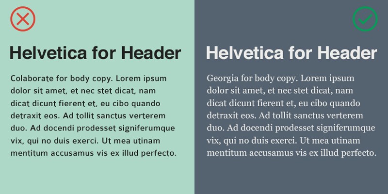
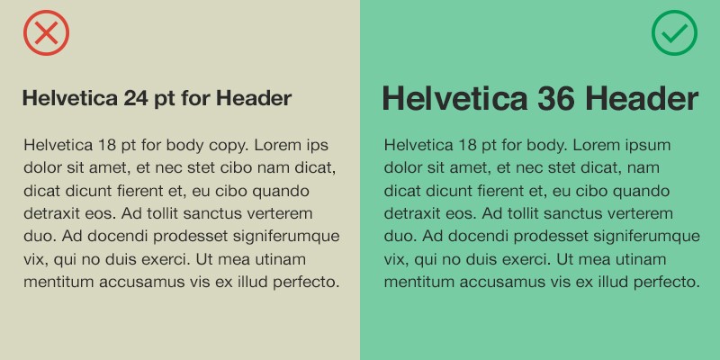
Distinctive font sizes
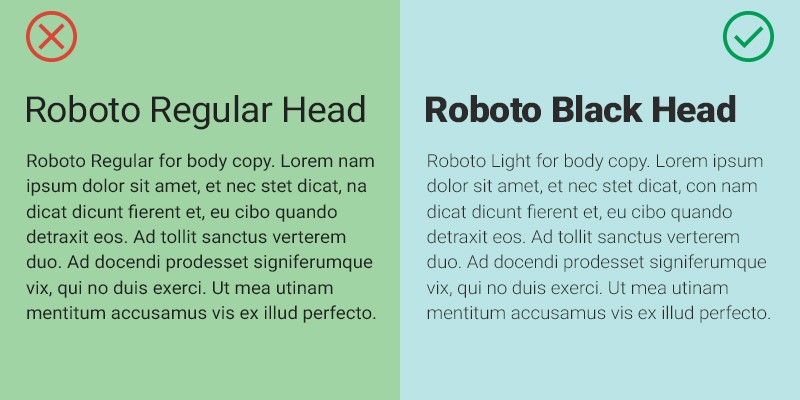
Balancing font weights
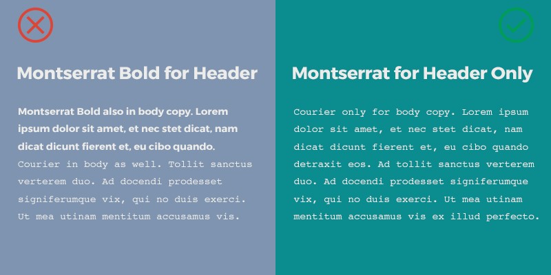
Giving each font its own purpose
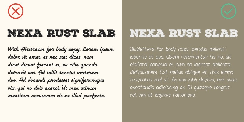
Avoiding different moods
Sticking to two, maximum three typefaces
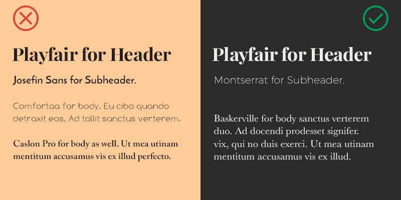
Unique and beautiful font pairings
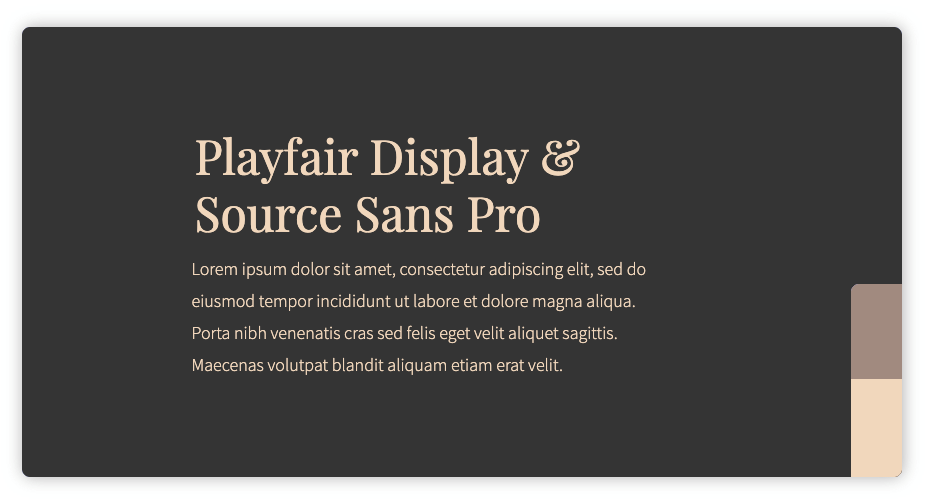
Below are some of the most elegant font pairings beautifully illustrated by Alexandra Mercier in her article “Top 50 Google Font Pairings [Handpicked by Pro Designers] (pagecloud.com)”.
Font pairing style: Classic, Serif + Sans Serif
Title font: Playfair Display
Paragraph font: Source Sans Pro
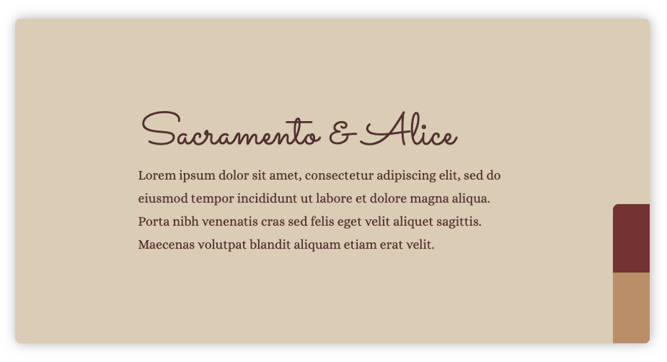
Font pairing style: Elegant, Script + Serif
Title font: Sacramento
Paragraph font: Alice
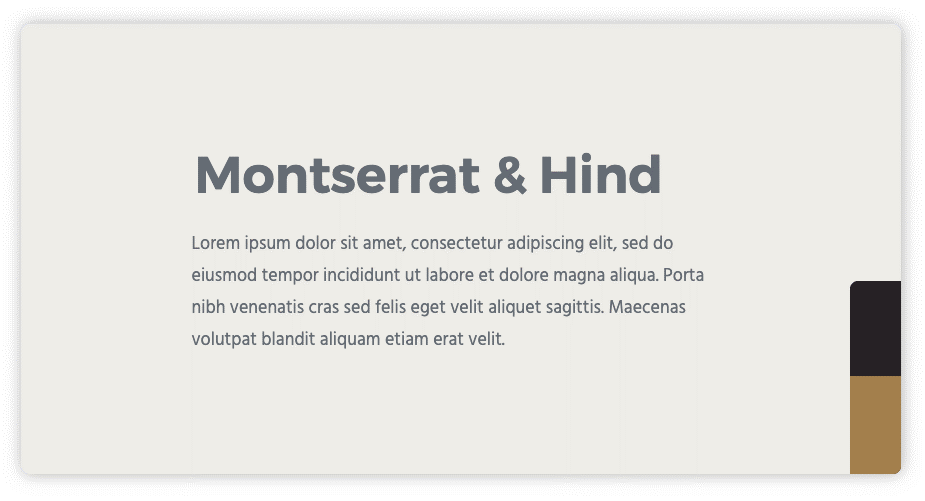
Font pairing style: Modern, Sans Serif + Sans Serif
Title font: Montserrat
Paragraph font: Hind
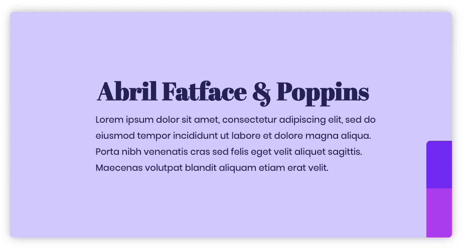
Font pairing style: Creative, Serif + Sans Serif
Title font: Abril Fatface
Paragraph font: Poppins
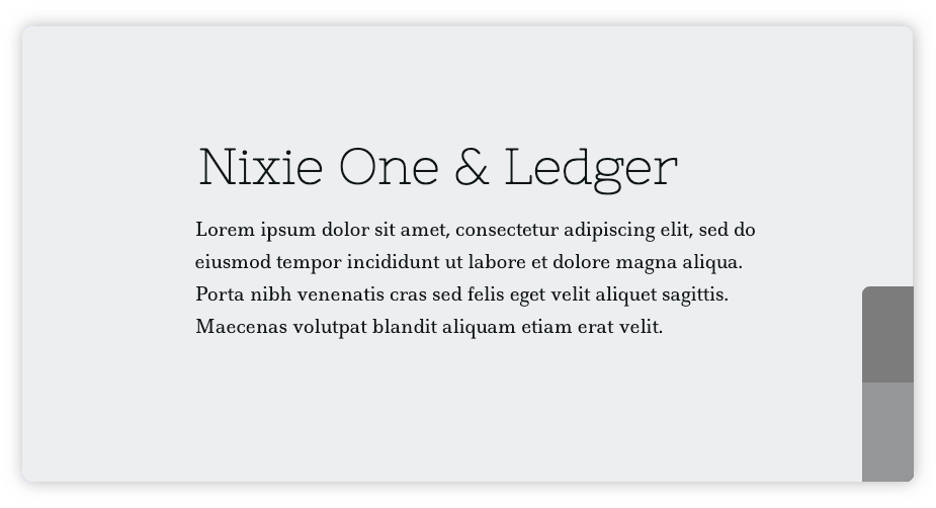
Font pairing style: Creative, Serif + Serif
Title font: Nixie One
Paragraph font: Ledger
To check out some more from the list, head on over to Top 50 Google Font Pairings [Handpicked by Pro Designers] (pagecloud.com)
Congrats! You’ve now learned the basics of typography and important pairing techniques ready to go ahead and pair your own fonts to create spectacular visual presentations, websites, or even designs! Visit the Heyday blog to into the loop of some more techniques that can up your marketing game!


